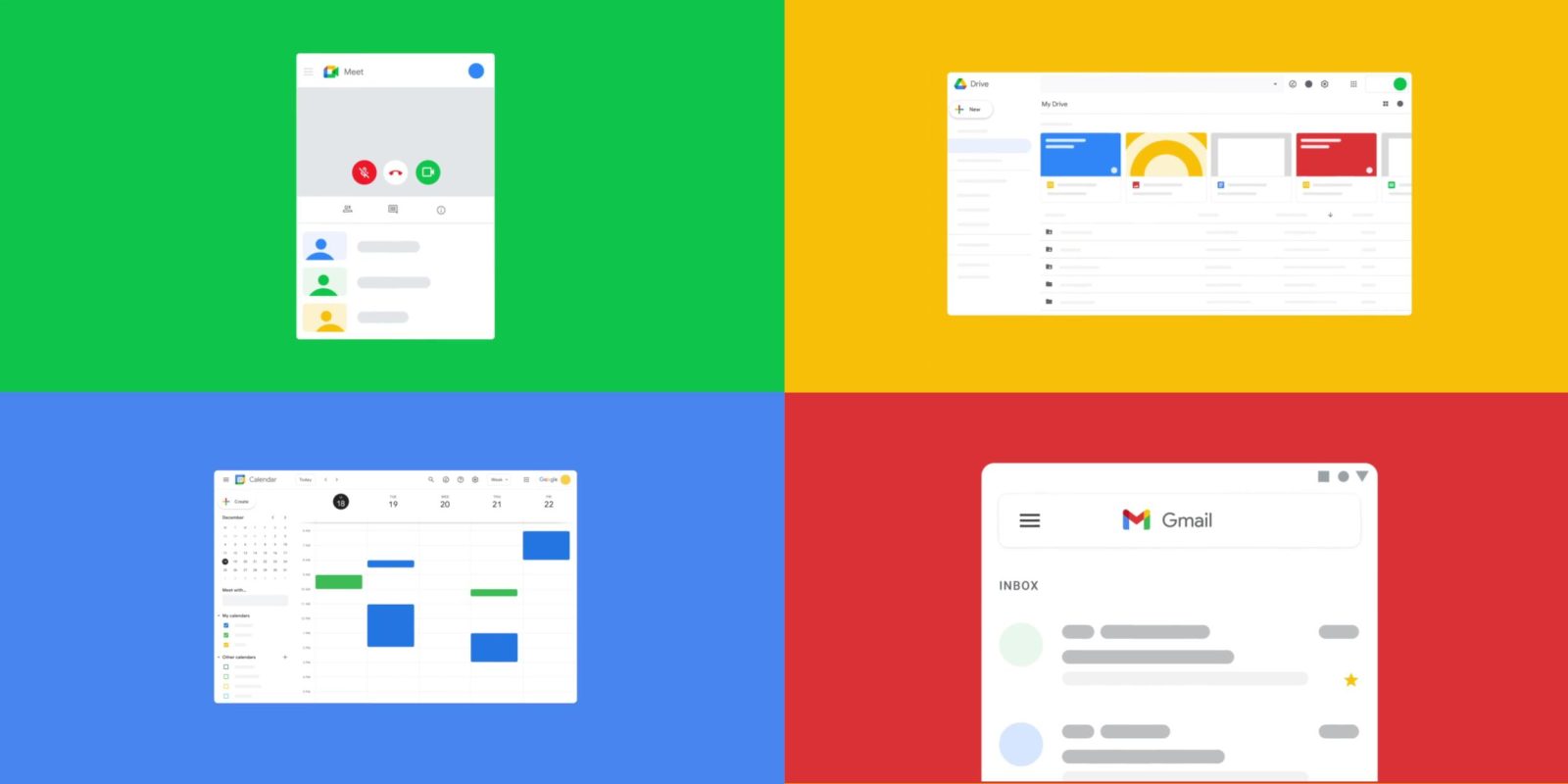
As part of Google Workspace, the company is rolling out new branding for its productivity apps. Gmail — as teased last month — will be getting a new icon, with Calendar, Drive, Docs, and Meet also following over the coming weeks.
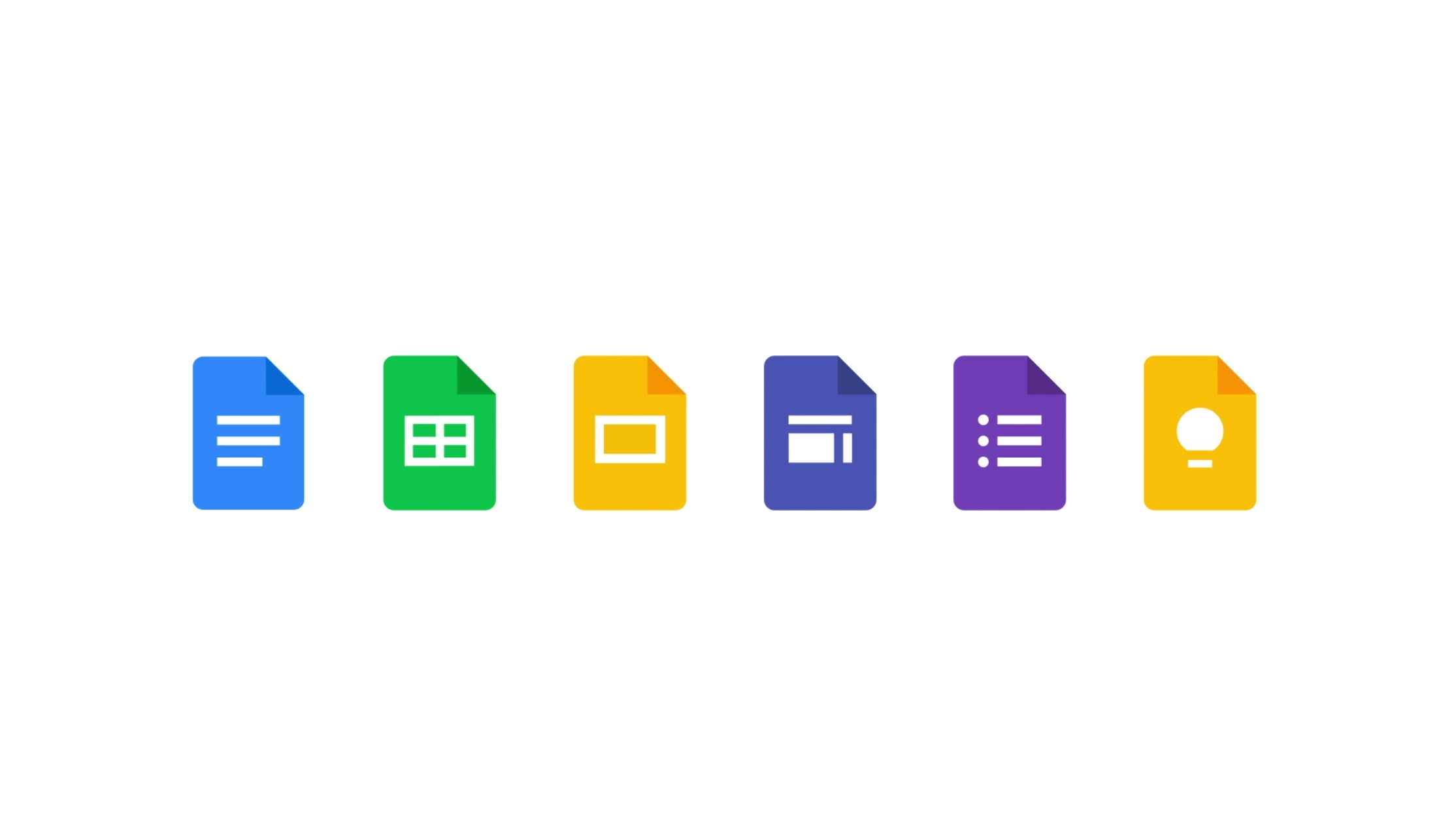
In the coming weeks, users will see new four-color icons for Gmail, Drive, Calendar, Meet, and our collaborative content creation tools like Docs, Sheets, Slides, that resemble the same family and represent Google Workspace’s commitment to building immersive communication and collaboration experiences, all with helpfulness from Google.
The new Gmail icon follows the design direction of modern Google apps. Just like Maps and Photos this year, the email service is adopting an icon that leverages the four Google colors of blue, red, yellow, and green to form an “M.” Red still has the largest share, but it comes as Google moves away from accent colors in its apps.


All past Gmail icons distinctly feature an envelope. It’s now only implied, with Google leveraging the whitespace above and below the center caret/chevron to form an envelope. It’s clever in that all modern smartphone icons are going to be placed against a white background anyway. These icons are flatter than before, lacking any shadows, but there is some layering occurring in all of them.
Meanwhile, Calendar gets a similar treatment to the new Gmail icon by dropping the physical object it was previously modeled after. It’s now a square with the bottom-right corner creased. Blue is the primary color, while “31” is in the center.


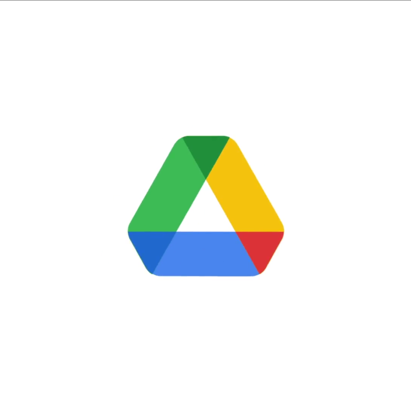
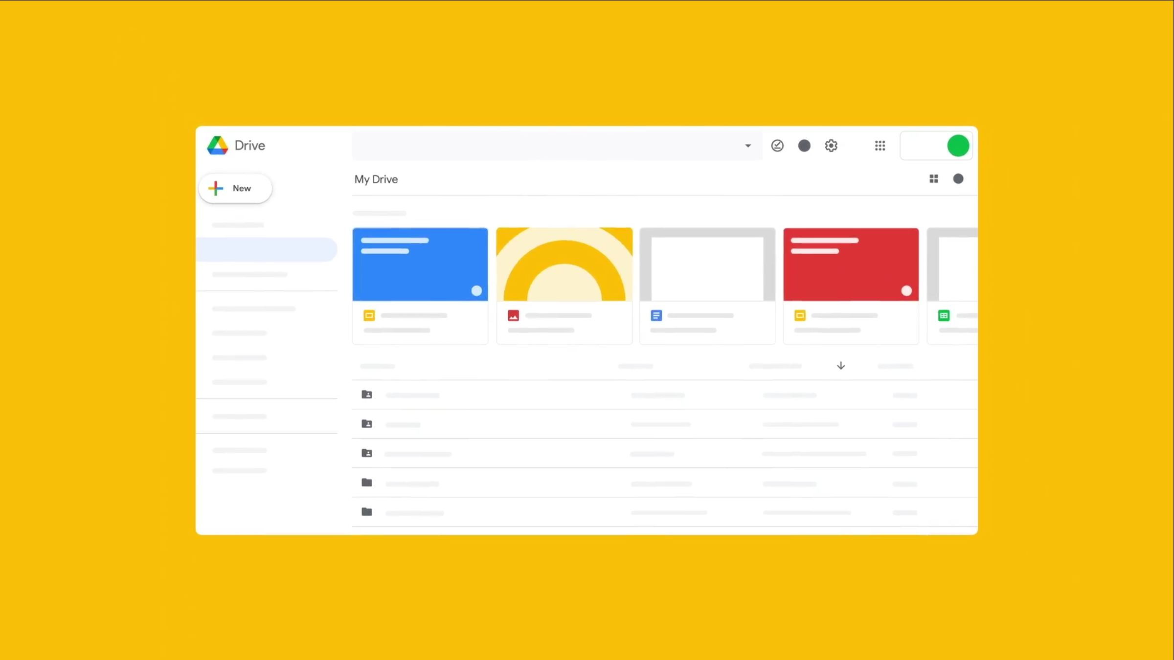
Drive is relatively unchanged, but the triangle gets slightly rounded edges. There is also a very subtle splash of red after the icon previously only had three colors. It’s the most minor change, but ends up being one of the most delightful.
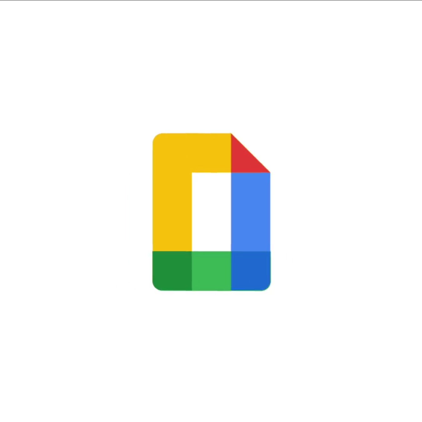
Given their relationship, Docs — a stand-in for all the editor apps — is basically Drive’s icon but as a rectangle and with a creased top-right corner. To clarify, it’s not clear if the merged icon will ever be used live in a product, or if it’s just intended as a visual representation.
Meanwhile, Google Keep’s background is no longer a square and now a sheet of paper. The light bulb’s design has also been flattened and visually simplified. In fact, all the editor icons have been ever so slightly tweaked.
Rounding out the new icons is Google Meet. Again, realism is dropped for a video camera icon formed from basic shapes.


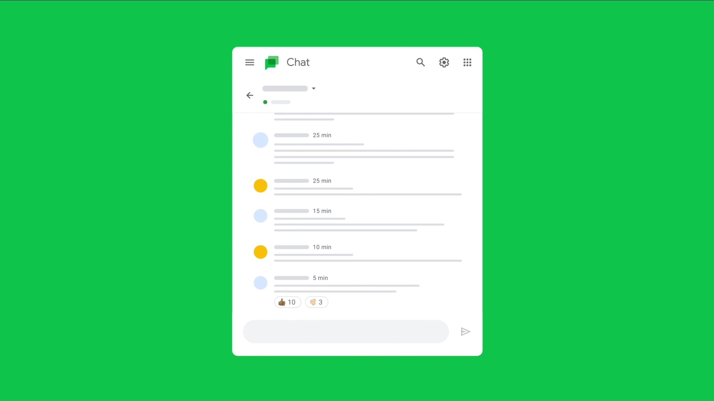
Chat is also getting a new flat icon, but is entirely green in a possible homage to Hangouts. All Google’s instant communication apps share this color.
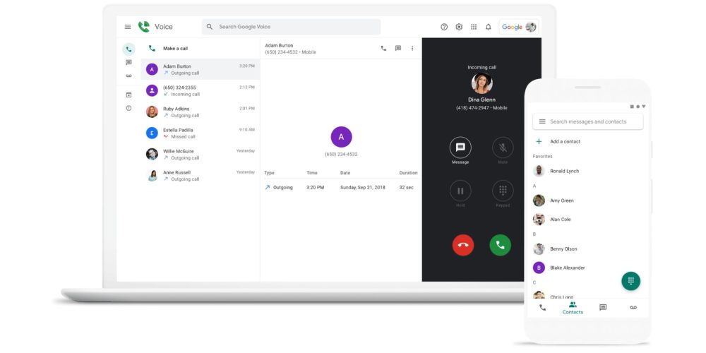
There’s also a new Google Voice icon. Similar to the existing one, the phone icon is out of the dark green chat bubble and has a signal emanating from it.
FTC: We use income earning auto affiliate links.
